|
The last few months have been interesting at Stock & Bull. We’re hard at work bringing you the Project Powerpunk demo. And the biggest challenge of this is turning all our rules, ideas, and thoughts into a product meant for human consumption. A large portion of this is editing and rewriting our rules. The rest of it is organization: How do I display all of this information to my reader in a form that is clear to read and easy to understand? If you have read a Tabletop RPG book, you may have some idea on how daunting a task this is. If the purpose of my rulebook is to teach you how to play my game, then what should I teach first? Or second? Do I start with how to create a character, or how to roll for a skill check? Which is more important? Most tabletop RPGs use similar conventions. Most of which I believe were established with Dungeons & Dragons: start with how to create characters (because without those you can’t play the game), then introduce the rules of the game. It explains what the numbers on your character sheet mean, then explains how they are used to play the game. I can largely copy what other games have done in the past and get by. Even still, Project Powerpunk is different. It’s not D&D, Fate, Gumshoe, GURPS, or Shadowrun. It’s different. The rules are different, the procedures are different. Within sections I still have a lot of choice as to how the steps are ordered. Take character creation for instance. Do I have you choose your powers first, or your traits? You can assume that I have complete freedom in what and how I accomplish this. However, each and every decision holds weight. It means the difference about you understanding or not understanding how to play Project Powerpunk. While researching how best to approach the layout of the Project Powerpunk demo I came to the realization that I made lots of mistakes. I was too focused on the words, their meaning, and the order in which I was delivering them. What I never paid attention to was how I was displaying those words. What you are reading is just as important as how it looks like. Time and time again the subject of typography had come up in my research. I would have to learn its dark arts and esoteric forms to make meaningful choices about how the Project Powerpunk demo would look. Typography deals with how text is visually displayed. Placing text on a screen, paper, or sign and showing it to someone is applying typography. It’s a crude example but true. You may think that I need no more than just picking a font and adding a cool background to my rulebook. Those are certainly a part of it. However, it’s a lot more involved. Typography goes beyond aesthetics, it’s utilitarian. The font I use, it’s size, the spacing of line and letters, how I point out key terms will do more than just make it pretty. It will have an effect on how readable the Project Powerpunk demo is. It’s the difference between you reading it from front to back, or putting it down after a page. Honestly, if I can’t hold your attention, does it matter how good Project Powerpunk is? Let’s try with an example. Here’s a snippet of the rulebook: 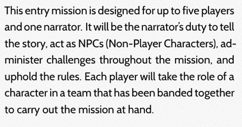 Do you see any key terms in that paragraph? Maybe. Would you guess that the key term I would like you to know is “narrator?” Likely not. I’m more inclined to assume that your eyes jumped to NPCs since I have it capitalized. But that subtle difference is enough to throw off what is most important about that paragraph. The next two are the same as before but with “narrator” made to look different than the surrounding text. I stuck with two very simple and easy to do methods. One is bold the other is italic:  Now choose which of the two makes the word narrator stand out more, bold or italic? I may split the vote on this one but I’m going to bet that more of you had picked bold for this. Why? Honestly, italics in this case does not really pop. The font used here is a sans serif font. In sans serif fonts, italics are simply made to be slanted versions of the original letterforms. There is not a large enough contrast to truly stand out against the rest of the text. Bold here does a better job. If you’re scratching your head about why italics is so bad in this case take a look at these next two pictures: 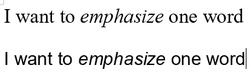 I’ve got the same sentence in Times New Roman and Arial. Arial is another example of a sans serif font. Times New Roman is a serif font. Serifs refer to the small horizontal protrusions of every vertical line in each letter. Look at how the italicized version of a word in Times New Roman looks. It’s letter forms are actually changed, not merely slanted. In Arial, they really are just crudely tilted to one side. Italics make a real difference in serif fonts. Not so in sans serif ones. Let’s look at those examples from Project Powerpunk again: 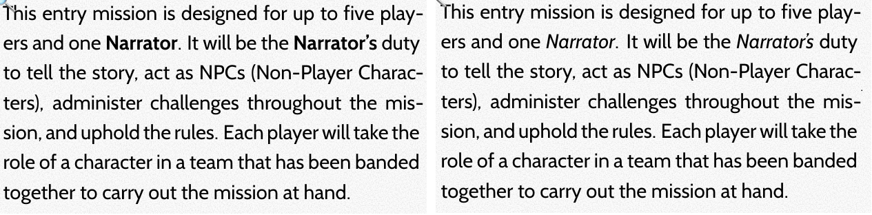 We already established that bold in this case was the better option, but ask yourself is it the best option? To all whom felt italics was the right answer before, you might have felt that way because bold in this case does not really pop either. I do agree with that assessment. Bold does contrast, but not a lot in this case. What if I combined the two? 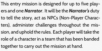 Is this just right, not enough, or too much? It’s a small example so it may be hard to tell. I probably will get a different answer to that question from each person who reads this, but try to look at it objectively. Does “narrator” stand out from the rest of the words? Absolutely. Now, does it stand out so much that the effect is jarring? Does this combination of bold and italic make this block of text easier or harder to read? From what I have learned the latter is true. Typography takes a “less is more” approach to applying emphasis. By doing both I’m making this harder to read and directing your focus too much. It might not truly register by reading one paragraph. However, a bit of focused robbed at every instance over the course of a book and I’m likely to kill your attention span before you have finished reading the Project Powerpunk demo. That’s not good at all. I bring up bold and italic because they are things that anyone who has used a word processor has seen and used. You might have fiddled with these decisions when writing essays for school and possibly made or avoided the mistakes I’ve discussed so far. They are not the be all and end all of adding emphasis to words or phrases. I just recently found out how effective small caps can be. 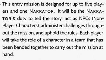 See how “narrator” looks? It’s definitely eye catching. All capital letters run counter to how our eyes are trained to read text and will always stand out (all caps is also an effective method of emphasis). But it’s not super jarring.
See how typography goes beyond aesthetics? It looks nicer and is easier to read. I’ve attracted your attention and helped conserved it at the same time. That’s not to say that small caps is the absolute best option for everyone or everything. It might not work well for everybody. It probably won't work well if I changed the typeface or the size of the text and it probably won't work if I were working on a different project with different needs. Typography’s true message is illustrating that regardless of what I choose, my choices have weight. Much like how it is to play Project Powerpunk.
0 Comments
Leave a Reply. |
Working to ...
Archives
March 2024
Categories
All
|
 RSS Feed