|
The last few months have been interesting at Stock & Bull. We’re hard at work bringing you the Project Powerpunk demo. And the biggest challenge of this is turning all our rules, ideas, and thoughts into a product meant for human consumption. A large portion of this is editing and rewriting our rules. The rest of it is organization: How do I display all of this information to my reader in a form that is clear to read and easy to understand? If you have read a Tabletop RPG book, you may have some idea on how daunting a task this is. If the purpose of my rulebook is to teach you how to play my game, then what should I teach first? Or second? Do I start with how to create a character, or how to roll for a skill check? Which is more important? Most tabletop RPGs use similar conventions. Most of which I believe were established with Dungeons & Dragons: start with how to create characters (because without those you can’t play the game), then introduce the rules of the game. It explains what the numbers on your character sheet mean, then explains how they are used to play the game. I can largely copy what other games have done in the past and get by. Even still, Project Powerpunk is different. It’s not D&D, Fate, Gumshoe, GURPS, or Shadowrun. It’s different. The rules are different, the procedures are different. Within sections I still have a lot of choice as to how the steps are ordered. Take character creation for instance. Do I have you choose your powers first, or your traits? You can assume that I have complete freedom in what and how I accomplish this. However, each and every decision holds weight. It means the difference about you understanding or not understanding how to play Project Powerpunk. While researching how best to approach the layout of the Project Powerpunk demo I came to the realization that I made lots of mistakes. I was too focused on the words, their meaning, and the order in which I was delivering them. What I never paid attention to was how I was displaying those words. What you are reading is just as important as how it looks like. Time and time again the subject of typography had come up in my research. I would have to learn its dark arts and esoteric forms to make meaningful choices about how the Project Powerpunk demo would look. Typography deals with how text is visually displayed. Placing text on a screen, paper, or sign and showing it to someone is applying typography. It’s a crude example but true. You may think that I need no more than just picking a font and adding a cool background to my rulebook. Those are certainly a part of it. However, it’s a lot more involved. Typography goes beyond aesthetics, it’s utilitarian. The font I use, it’s size, the spacing of line and letters, how I point out key terms will do more than just make it pretty. It will have an effect on how readable the Project Powerpunk demo is. It’s the difference between you reading it from front to back, or putting it down after a page. Honestly, if I can’t hold your attention, does it matter how good Project Powerpunk is? Let’s try with an example. Here’s a snippet of the rulebook: 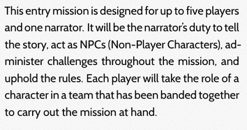 Do you see any key terms in that paragraph? Maybe. Would you guess that the key term I would like you to know is “narrator?” Likely not. I’m more inclined to assume that your eyes jumped to NPCs since I have it capitalized. But that subtle difference is enough to throw off what is most important about that paragraph. The next two are the same as before but with “narrator” made to look different than the surrounding text. I stuck with two very simple and easy to do methods. One is bold the other is italic:  Now choose which of the two makes the word narrator stand out more, bold or italic? I may split the vote on this one but I’m going to bet that more of you had picked bold for this. Why? Honestly, italics in this case does not really pop. The font used here is a sans serif font. In sans serif fonts, italics are simply made to be slanted versions of the original letterforms. There is not a large enough contrast to truly stand out against the rest of the text. Bold here does a better job. If you’re scratching your head about why italics is so bad in this case take a look at these next two pictures: 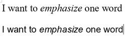 I’ve got the same sentence in Times New Roman and Arial. Arial is another example of a sans serif font. Times New Roman is a serif font. Serifs refer to the small horizontal protrusions of every vertical line in each letter. Look at how the italicized version of a word in Times New Roman looks. It’s letter forms are actually changed, not merely slanted. In Arial, they really are just crudely tilted to one side. Italics make a real difference in serif fonts. Not so in sans serif ones. Let’s look at those examples from Project Powerpunk again: 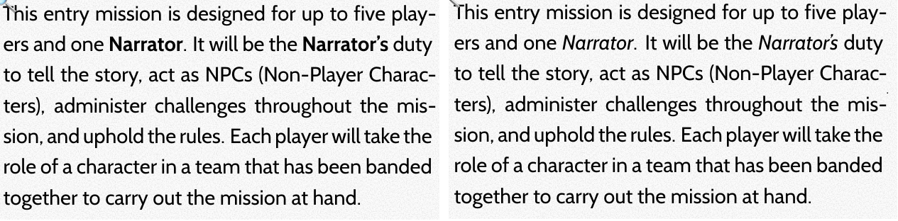 We already established that bold in this case was the better option, but ask yourself is it the best option? To all whom felt italics was the right answer before, you might have felt that way because bold in this case does not really pop either. I do agree with that assessment. Bold does contrast, but not a lot in this case. What if I combined the two? 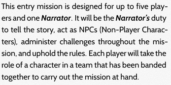 Is this just right, not enough, or too much? It’s a small example so it may be hard to tell. I probably will get a different answer to that question from each person who reads this, but try to look at it objectively. Does “narrator” stand out from the rest of the words? Absolutely. Now, does it stand out so much that the effect is jarring? Does this combination of bold and italic make this block of text easier or harder to read? From what I have learned the latter is true. Typography takes a “less is more” approach to applying emphasis. By doing both I’m making this harder to read and directing your focus too much. It might not truly register by reading one paragraph. However, a bit of focused robbed at every instance over the course of a book and I’m likely to kill your attention span before you have finished reading the Project Powerpunk demo. That’s not good at all. I bring up bold and italic because they are things that anyone who has used a word processor has seen and used. You might have fiddled with these decisions when writing essays for school and possibly made or avoided the mistakes I’ve discussed so far. They are not the be all and end all of adding emphasis to words or phrases. I just recently found out how effective small caps can be. 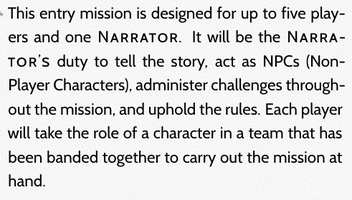 See how “narrator” looks? It’s definitely eye catching. All capital letters run counter to how our eyes are trained to read text and will always stand out (all caps is also an effective method of emphasis). But it’s not super jarring.
See how typography goes beyond aesthetics? It looks nicer and is easier to read. I’ve attracted your attention and helped conserved it at the same time. That’s not to say that small caps is the absolute best option for everyone or everything. It might not work well for everybody. It probably won't work well if I changed the typeface or the size of the text and it probably won't work if I were working on a different project with different needs. Typography’s true message is illustrating that regardless of what I choose, my choices have weight. Much like how it is to play Project Powerpunk.
0 Comments
 I love fiction, which I find funny because I don't like to lie. Still, the creative process for making something that is fantastic and unreal is fun for me; it's the draw of urban myths and cryptozoology like the Candyman, Katy Perry, or Bigfoot. The things that cannot REALLY exist, no matter how much you want them to, are the best. The same goes for places like Santa's workshop in the North Pole or Sesame Street on the East Coast of America. Right now, my focus is on settings. Realms of myth and legend, castles and dragons; the idea of planets with diamond rain or plasma snow fascinates me to seemingly no end. The fictional settings that most resonate with me, however, have a root in the real; where you are 98% sure that strange oddity isn't real, all the while that 2% is still there leaving you with a lingering doubt. With Project: Powerpunk, we went to capture that excitement of "what is not, but could be." Then we were met the greatest problem of this creation model.
"Where do my ideas fit?" For example, your game master tells your group that you’re hunting a vampire in Paris, a city that is known for its landmarks, its people, its "character.” However, in an effort to put his own spin on Paris, the game master has decided to take some liberties and replace the Louvre with a "Texas Longhorn Steak Shack," the Eiffel Tower with "Mack's Truck Stop and Shrimp House,” and have all the Parisians speak with a thick American southern-twang, calling people "Ya'll" and "Hun.” Of course, this will evoke very different feelings from what you’d probably expect from the "City of Love.” Doubt will set in and the ability to connect with the setting will suffer. However, it’s not always so fun to run a local history lesson in the guise of a game either. While the Arc de Triomphe de l’Etoile lists every major French military victory and the general that is credited with that victory, I don’t want to play a game to learn all of their names nor do I want to play through each day of the arc’s construction. Marrying the fun part of fictional setting work with the solid foundation of a real location can yield something amazing and thus come the ideas of “interpretation” and “adaptation.” Returning to Paris, instead of bizarre setting concepts or pointless and boring information, your game master could take you down into the Tomb of the Unknown Soldier buried beneath the Arc and reveal how the Unknown Soldier is just an alias for an immortal who stalks battlefields preying on fallen soldiers. “Adapt” reality and “interpret” it within your fictional setting. Before we accepted these concepts of adaptation and interpretation, we kept finding that our setting ideas and the changes we wanted to make were pigeonholed; forced forward the way one would shove something into a tight, uncomfortable place (and I don't mean the back of a Volkswagen). Given that we were not naive folk on the rebound after a bad breakup, we were not very receptive to this process. But when we started to adapt the real world and omit certain real life changes, make unique changes of our own to make it part of OUR story and OUR world, we grew more comfortable and we were finally able to make something that is specially made by us. The setting of Project: Powerpunk is our own "scientifiction" adaptation of New York City; open to fantastic, almost magical, changes and futurist ideas. I loved the idea of New York for two reasons. First and foremost it is my home; I know NYC better than I know any other place. If we made the setting Paris or London, it would ring false and hollow. That being said, I’m not a playboy party machine so I don’t know the city as well as I want to either, but then again a lot of the allure and danger that I anticipated in going to certain clubs and hot spots have been dashed as they have since been closed down. This leads me to my second reason: the city I was prepping for is not the city I grew up into. I had family members through my childhood tell me of the dangers of this club, that alley, this drug, that party, or this neighborhood. There were tales of danger and excitement such as fleeing from a gang at one party only to end up facing other enemies at the club you hide out in or deciding to approach a new lady at a bar only to find out that she is actually looking for you to sell you out and cover her debt with someone else. There were dirty, grungy tales of a tough as nails city that shined bright for tourists and locals alike only to cast deeper shadows that would drag everyone down. I know that it is for the best that the real New York City is no longer that romanticized wild metropolis anymore but there has always been a part of me that wants to rub elbows with today's nobody band, watch them do a show in the same neighborhood bars where I once thought I would drink, and after telling the lead singer that the last song of the set was kind of trash, get his fist to my face, break a bottle over his head (preferably his bottle too, you know, add insult to injury) and use the broken glass to fight off the rest of the band as I made my getaway. Then I would ingest some poison that I shouldn't and go to a blue-collar job the next morning so I can start the cycle again from the beginning the next evening. (Some months down the line, after watching them skyrocket to fame, I could have a spiteful chuckle to myself when that crap lead singer goes to jail after his bassist dies of an overdose at the biggest nightclub in the city.) I know that realistically I am better off not having done ANY of that but a part of me laments the path not traveled. Not simply because I chose not to fall to its allure, but because that avenue was closed off and the choice was taken away for me. In Powerpunk, I have been able to put to the page the romanticized, dangerous playground of the "rubble kings," the "Gordon Gekkos," and the "Agent J’s" and that wouldn't have the same feel if I threw together a bunch of big buildings and called it "Metrotopiaville." With the basis still being New York City, that history and presence is preserved even as we added augmented reality advertisements and NYPD drones in Manhattan that are knocked from the sky by “Gargoyles,” customized drones belonging to gangs. In Queens, we have a medical research organization that has begun to release new analgesic drugs and promising medical breakthroughs in the field of “Ansenectum” (anti-aging) in the form of wrinkle removal salves and muscle rejuvenating diet programs as cyber-cowboys mount non-lethal weaponized motorcycles and patrol the borough protecting the people from law-breakers that the NYPD can’t “be bothered to” apprehend. All the while, an average blue-collar worker heads off from a mob-owned work site to a bar to down a drink before getting into an argument with the lead singer of today’s nobody band about a crappy last song only to get hit in the face then bash the lead singer over the head with a bottle and make his getaway home all to do it again tomorrow. The foundation is real but what we present is not (at least not yet.) It’s game night and your game master is finally ready to run the evil sorcerer campaign he’s been preparing for weeks. But when everyone takes a turn to describe their character for the group, you notice that everyone else’s character seems to have a bit more to them than just a name and stats. So, when you describe your character only as “Punchara, the battle axe-wielding barbarian,” your GM asks that you provide some hobbies or interests that Punchara would pursue outside of slaying an evil sorcerer. “Even Wandaar,” he says, “is a savvy businessman with a penchant for investing in private magic schools which allows him to sway the region’s curriculum towards the dark arts.”
What’s a barbarian to do? Some of the most engaging characters I have encountered and created in the tabletop games I’ve played have been those with hobbies or professions: adventuring brothers who sought rare artifacts and items to sell in their shop; a pirate who moonlighted as a confectioner, “procuring” funds to run a candy-themed restaurant in a city while his crew’s airship was being repaired; a megalomaniacal tyrant who used bureaucracy to allow him and his cohorts to legally invade another sovereign nation without triggering a war. When you provide your character with extracurricular interests, you add substance to both them and the overall story. Extra details like these help your game master have an easier time devising new and exciting challenges for the campaign. So, now that Punchara has a vested interest in architectural design from her past quests in various dungeons, she can keenly deduce where Wandaar would install traps and other hazards in his “Castle for the Magically Gifted.” To encourage our players to consider what professional skills their characters would have, we created a section in the B+ System called “Practices” that will allow your character to exercise their knowledge in various fields of study should they be doctors, dancers, or diplomats. It will also set the guidelines for what your character will be allowed to craft or repair during the game. Let’s say, for example, a character has “automotive engineering” as a practice. Using this practice, the character will not only be able to repair a car engine that has broken down in the middle of the road but will also be capable of designing and creating their own unique engine to use in drag races! Or if a character has expertise in “painting”, they may try their hand at restoring damaged pieces of art as well has painting their own works. Practices are not necessary to play Project: Powerpunk (after all, some players may just want to focus on questing, fighting, or social interactions), but they do provide a whole other dimension for you to explore and feel more immersed in your character. We hope you look forward to the possibilities Practices will provide you as much as we look forward to the experience you have. Chris High Eldritch Scribe | Stock & Bull Entertainment A while ago Stock & Bull was featured in this article about tabletop and board game designers. The writer, Kyle of 21stcenturycardboard, was looking to interview people who developed their own original systems. We happily agreed and our own Sam Carter interviewed with Kyle to discuss Project: Powerpunk and why we created our game. The reason I bring up this old news is because we realized we were doing something not a lot of game developers apparently do; Instead of making a homebrew system based on a currently established one, like Dungeons and Dragons’ D20 System or White Wolf’s Storytelling System, we here at Stock & Bull set out to make our own original system for Project: Powerpunk. We made the B+ System. Why “B+”? Well, because it’s a passing grade.
The B+ System has been—and continues to be—meticulously designed to be modular so that players can play however they like at any level. There are some games that are simple from start to end, where you simply quest, loot, and move on and the difficulty only ramps up based on the stats of the NPCs and monsters that are faced. Other games offer a multitude of features that end up becoming ignored once players find “the right way to play” and stock up certain stats that guarantee victory in almost all situations. B+ aims to keep things engaging at any stage of play with versatility and scalability. So what are the features of the B+ System? Well superpowers are certainly a major part of the system, especially Project: Powerpunk, but there is so much more. We wanted just about anything to be possible in our game so we put in the groundwork for and developed a number of different features and aspects to achieve that goal. We’ve worked on ways to create your own fighting style, made the professions you choose affect your character’s capabilities, built a fluid social combat system (which has been touched on here), and are trying to make sure players have the ability to craft almost anything. We want to do all these things and more so that players will always be able to look back at our game and find something new to enjoy. So keep tuning back here to learn more about B+ and please feel free to comment with any thoughts you have. We always want to know what the public is thinking because Project: Powerpunk is meant to be shared with everyone. Otherwise we’d have just kept it as our own private homebrew! Chris High Eldritch Scribe | Stock & Bull Entertainment |
Working to ...
Archives
March 2024
Categories
All
|
 RSS Feed